It is not difficult to achieve professional quality prints with the image assets that you purchase. In fact, it is easy. Some buyers print their posters at home, while many take advantage of low-cost large format printing readily available in their local communities. Either way, you will be able to get the poster you want with a minimum of trouble if you follow these helpful hints.
Where To Print?
We are represent a collective of artists and not printmakers, and this is by choice. Making art is one thing, printing it is another art in itself. That said, there are literally hundreds of great places to get your images printed online and likely a very large number of capable printers near you right now, in your own city or town. We suggest that you support your regional economy; shop local! (Hint: Enable location on your browser and device, click this Google link, and scroll to Businesses section of results to find way more choices than you probably expect.) The main thing that you want from your printmaker is good quality, heavyweight poster paper and the ability to print up to 24 inches on a side. That’s it! Ask for these two things and you are halfway to printing the art of your dreams. If you would like to know more, please read this page, below, for all kinds of info.
Color Space (Huh?)
The images purchased are downloaded in the RGB color space. In the olden days of print, CMYK was the de facto color space for four-color commercial printing. CMYK works by adding pigment to white paper to create a color. It uses three colors (cyan, yellow, and magenta) and pure black to render an image. It is not interchangeable with RGB (which is primarily used in digital media and can represent a much larger array of vivid color using red, green, and blue pixels) due to CMYK’s reduced gamut and subtractive, four-color model. An RGB image printed on a CMYK-only printer will appear washed out (or even quite bizarre in terms of color rendition if a particular RGB color is out of CMYK gamut range.) Today, most printer hardware gladly accepts RGB color space documents and some will print only those types. If you absolutely require CMYK for your print, no problem! Drop us a line after purchase and we’ll send it right over (with a generic SWOP2006 color profile.) Learn more about color spaces, below: TL;DR…RGB vs. CMYK Color Spaces.

General Size Considerations
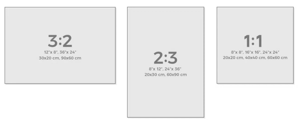
All image assets purchased are downloaded in uncompressed 300 dpi RGB (with no embedded color profiles) PDF file format, and at one of three sizes and resolutions. For 3:2 poster art, the size is 10,800 x 7,200 pixels, with a native paper size of 36 x 24 inches. For 2:3 posters, the size is 7,200 x 10,800 pixels, with a native paper size of 24 x 36 inches. For 1:2 posters, the size is 7,200 x 7,200 pixels, with a native paper size of 24 x 24 inches. The native paper size is ideal but images can be printed larger (with loss in quality) or smaller (with no appreciable loss in quality.) The basic rule is that you can go somewhat larger, and you may not notice any loss in quality at all; and you can always go smaller and get no discernable loss in quality.
Large format printer hardware may have difficulty printing to the edge of the document. This is not a fault of the image itself but, rather, of the destination printer used. Many high-quality printers will print to the edge of the paper or very close to it (or may even allow bleed beyond the paper) so it is best to take this into consideration when printing. If you wish to have a white border around your print, perhaps to simulate a matte, then this is easily achieved by compressing the image to fit the maximum printable area for a given printer. If you wish to have a large matte area, then resizing the image or printing centered with printer compression can achieve this look. It is a creative process, so be creative.
Making Images Smaller
If you wish to print a poster at home and have tabloid printing available, then you may print them this way. However, you have a few decisions to make. First, allowing the printer to maximize the image to fit the paper may not be a good idea for the most accurate printing. In the case of a 2:3 image, for instance, the ratios of printing would be incorrect to accurately represent the image as designed. An 11 x 17-inch (tabloid) printed page will certainly accommodate a 24 x 36-inch image when scaled down, and with no apparent loss of quality; however, 11 x 17 inches represents an image, while very close to 2:3, that is actually 1:1.54. When this is printed to full width, some small height waste will result, and you will have to trim the print. However, if you can live with the minimal distortion, please feel free to print at 11 x 17 inches for 2:3 images and at 17 x 11 inches for 3:2 images. A 1:1 image will print at 11 x 11 inches, of course.
A3 paper size is functionally equivalent to 11 x 17-inch tabloid paper size. It is 11.7 x 16.5 inches. However, the image printing will have identical considerations to printing at tabloid dimensions.
Making Images Larger
If you would like to print at another, larger size, then you assume all risks. That said, buyers have reported printing at what might be considered an excessively large format and are happy with the results. In essence, it has a lot to do with how close you intend to view the final print. A print size of 4 x 6 feet (as opposed to the native 2 x 3 feet) will work, so long as you are not too concerned with up-close image quality. From normal viewing distances, this may very well look just fine. In fact, many printers will expand an image using pleasing and natural, built-in dithering to accomodate for these enlargements. Your mileage may vary. Give it a try!
As well, printing an image at 24 x 36 inches, for example, and framing with a large matte border will yield a very large and impressive piece of artwork, when taken as a whole. How large is too large? This is limited only by taste. Many fine works have been framed with enormous mattes. A framing shop will help you decide what looks best for your space. As with sourcing a favorite printer, we are sure that there is a framing shop very close to you right now if you live in almost any city or town on Earth. If you are viewing this site at a research outpost in Antarctica or on the International Space Station, however, we cannot guarantee availability of any particular resource. 😉
TL;DR…RGB vs. CMYK Color Spaces
RGB – an additive color space
RGB (Red, Green, Blue) colors are the ones you see on your computer monitor and on other digital screens. For these colors, we add various amounts of red, green, or blue to a black canvas to get different colors and, when these three colors are added in equal intensity, they make white. This means you can make lots of bright and neon colors with this color mode that don’t really translate well to print but look fantastic on a screen. The range of colors of a given color space is termed the gamut.
CMYK – a subtractive color space
CMYK colors are made from Cyan, Magenta, Yellow and black (or Key). They are subtractive – this means that the starting canvas is white and, as colors are added, it gets darker and darker. Print uses the CYMK color mode because we start with a white background (like paper) and add colors to it until it gets darker. Because we can’t add white, this can mean CMYK colors aren’t as bright as RGB colors, which is why the colors you print often look a little duller than they do on your screen. Thus, the gamut of CMYK is reduced compared to RGB and, in fact, certain color values of RGB can’t be reproduced at all in CMYK (they are out-of-gamut) and are discarded when converting to this mode. Since it originated in four-color printing that utilized a lot of text elements, sometimes printed over other colors, pure black is a special case in CMYK as it is given its own “channel.” Blacks can theoretically render much more accurately on white paper in CMYK than in RGB, which is a possible advantage of this color space.